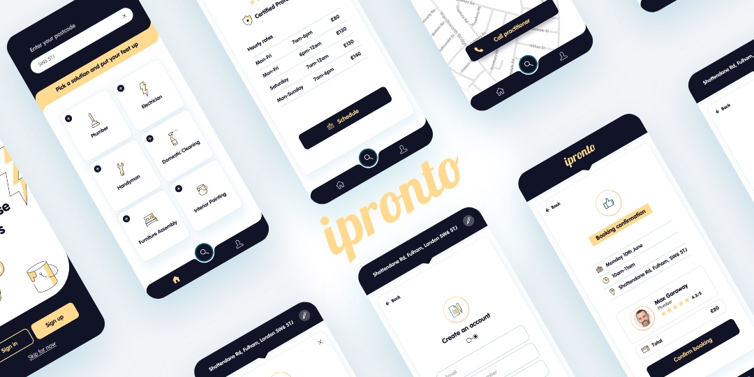
What is hiber?
Hiber is a B2B software marketplace that enables trades people to buy boilers and parts without upfront financial commitment. This is one of main offerings currently available. They are also able to create quotes for their customers, order and pay through the app.
My role as UX/UI Lead
At hiber I help to bring the company’s vision to life through UX/UI. My approach consists in scoping projects by identifying the main pain points, mapping out journeys, conducting user research, usability testing and prototyping in order to validate ideas. I’ve worked on a number of projects since joining the company which helped improve the App’s experience. Some of these include a more objective and seamless onboarding journey for new users and a completely new strategy to the current e-commerce platform. Always with the user in mind, I have conducted over 30 interviews in London, Liverpool and Leeds to validate hypothesis that were translated into practical solutions to the end user.
Case studies
UX/UI
Improvements
Sign up / Onboarding
Overview
The current flow seems to be quite a lengthy process for sign up/onboarding. 25 screens including scheduling a meeting and the user has no prompt (CTA) to start using the app after the whole journey has been completed.
The strategy will look to get new users as quickly as possible to create a quote. Capture the very minimum info required to start the journey — let the engineer explore the app, get familiar with the proposition and interface. Once the concept is perceived as valuable, a more in depth data capture can be put in place in the flow.
This document will propose some immediate changes to the current flow and content to help reduce the drop off rate by removing friction when signing up.

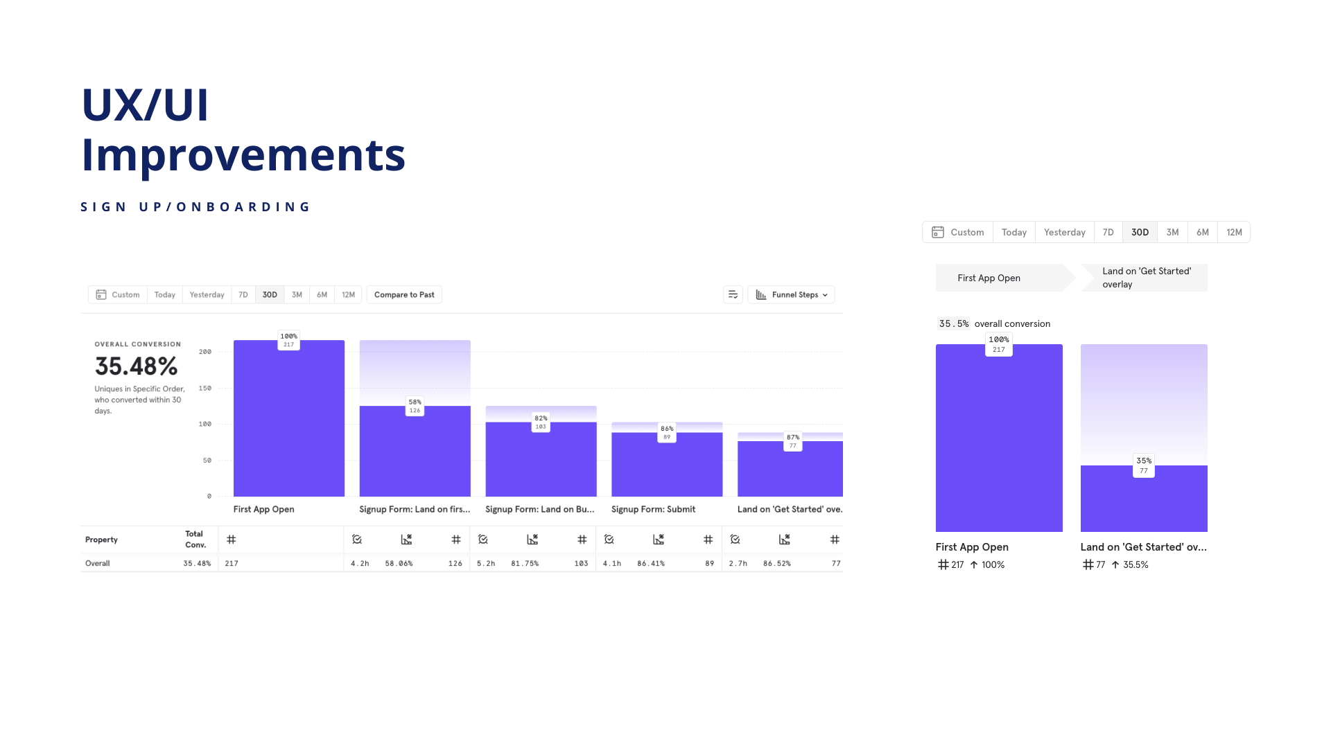
%
Drop off rate
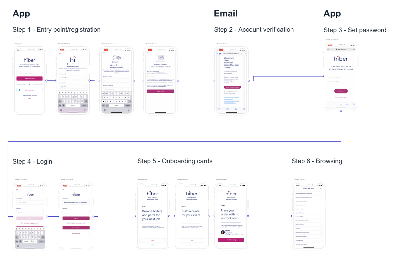
Mapping out the current flow
Touch points to reach the parts selection and start exploring.
Input fields (excluding business address subcategories)
Core steps

research
Usability testing
This part of the process will help to Identify pain points and patterns throughout the journey. 8 users took part in the research. It took them approximately 7 to 10 minutes to complete the registration process.

Identifying the main pain points
After going through the journey and analysing each step of the way the following pain points emerged:
1. Too many steps to sign up.
2. Lots of non mandatory fields and features that seem to make the process even longer and end up creating a barrier to access the core proposition which is to create quotes, buy parts and send to the customer. Those fields could be placed further down in the journey, for example ‘add business logo’ and ‘VAT number’.
3. Being sent to ‘different places’ in the journey as part of the sign up process — App (registration), email confirmation, Browser (password set), Google play store (for Android users), App (sign in), back on the App with more data capture, followed by the scheduler and lastly the onboarding cards.
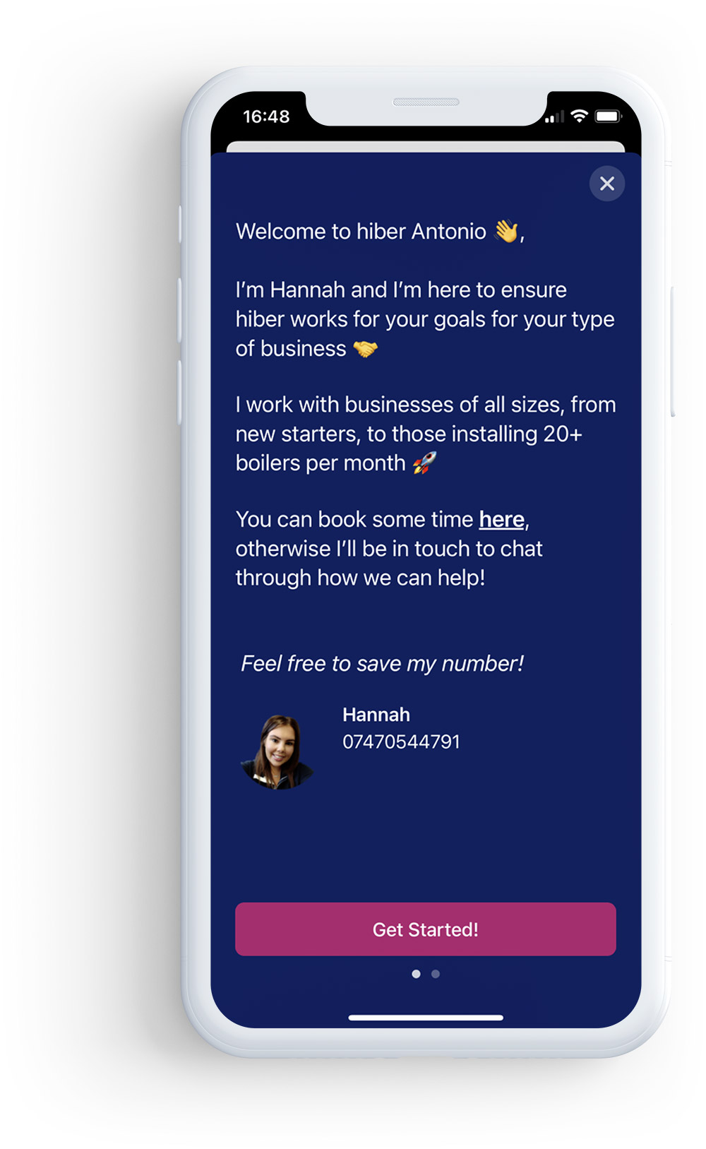
4. The value of ‘what best describes you?’ Section wasn’t clear at this stage. The next screen presents a picture and a ‘wordy’ explanation. Also, no way to exit the page as the X is hidden until the user starts scrolling. The only CTA (hyperlink) on this page is ‘book a consultation here’
5. Having to manually input information that has already been provided on other stages of the journey. For example: No Auto fill for first name, last name and email address on the scheduler flow.
6. Hitting a ‘dead end’ after a meeting has been scheduled without the possibility to start using the App.
Proposed solutions
This stage looks into practical solutions to reduce the drop off rate by removing friction when signing up.
1. Reduce the number of steps in the journey from 25 to 11 touch points — by eliminating unnecessary steps we should be able to optimise the flow and significantly improve the experience by reducing the time it takes to start exploring the quote journey.
2. Clear messaging from the first screen — Introduce a short description of the main offering within the App (The fastest way to price & order boilers and parts for gas engineers) to clarify the proposition.
3. Ask for email address upfront to initiate the journey and increase commitment — this section looks to create engagement before other fields are presented and produce key data capture.
4. Introduce alternative ways to sign up using Facebook, Google and Xero.
5. All non mandatory fields could be hidden at this stage and captured later in the journey — Let the engineer explore the app, get familiar with the proposition and interface. Once the concept is perceived as valuable, a more detailed data capture for a full sign up can be put in place in the flow.
6. Should ‘how did you hear about us?’ be a mandatory field at this stage? It’s great for us to know how they found hiber but at this point it seems an unnecessary extra step from the user’s perspective.
7. Carry out (auto fill) the information that has already been provided. For example — email address after the password had been set up. At the moment, after a new password has been created the user needs to manually input the email address again before logging in.
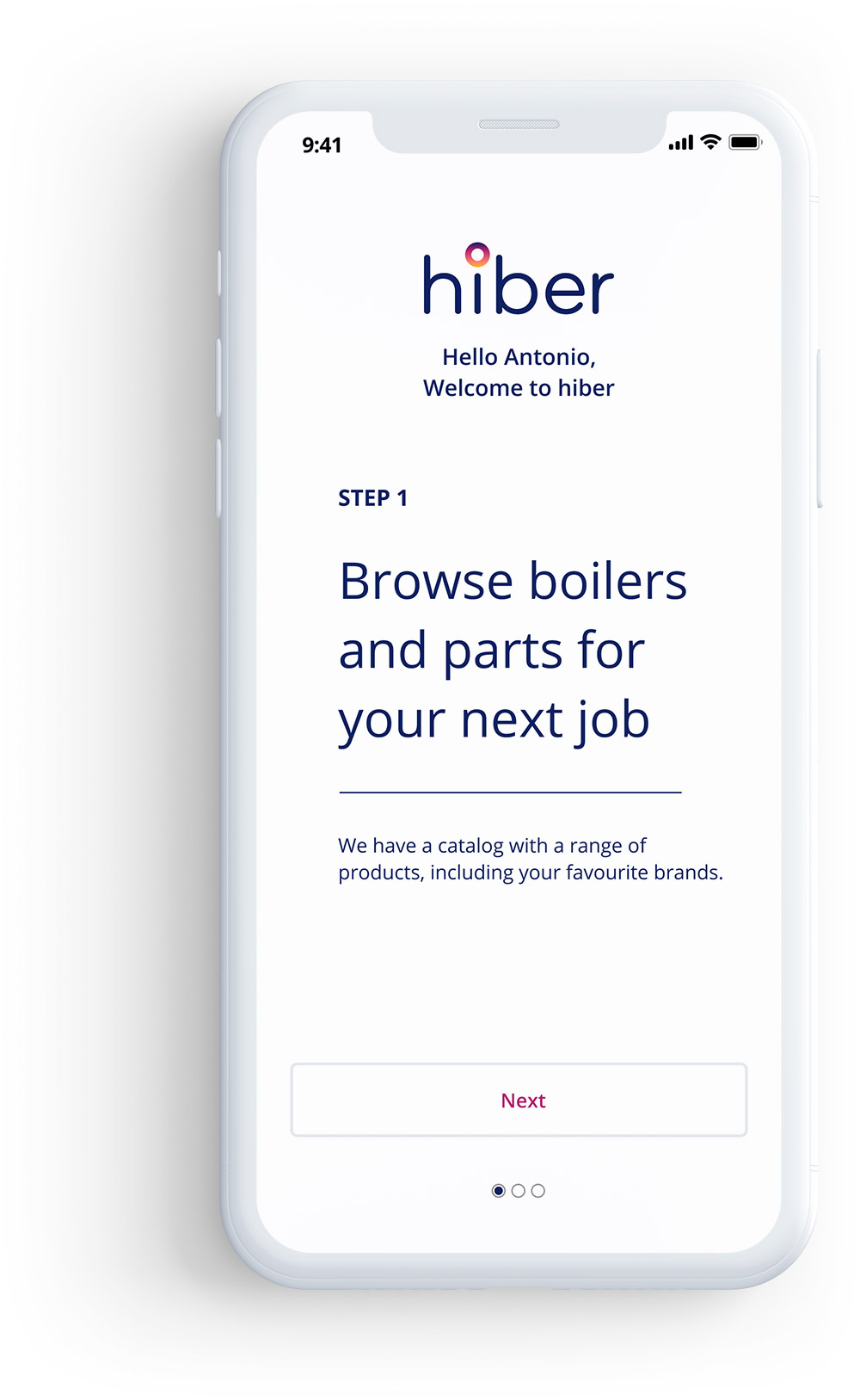
8. Onboarding cards messaging to focus on a more self-service approach. Breakdown the part selection flow to make it really clear what the purpose of the App is. Explain what hiber does in 3 simple steps.
9. Send the new user to the main menu with all categories listed — the objective here is to remove any distraction and focus on presenting relevant information at this stage.
Registration
Ideation
1. Introduce a short description of the main offering within the App (the fastest way to price & order boilers and parts for gas engineers) to clarify the proposition.
2. Ask for email address upfront to initiate the journey and create some level of commitment before all other fields are presented.
3. Introduce alternative ways to sign up using Facebook, Google and Xero.
Current

Proposed

Mapping out the new flow
Touch points (screens) to reach the parts and start exploring
Input fields (excluding business address subcategories)
Core steps
Input fields
Ideation
All non mandatory fields could be hidden at this stage in the flow.
Should ‘how did you hear about us?’ be a mandatory field at this stage? It’s great for us to know how they found hiber but at this point it seems an unnecessary extra step from the user’s perspective.
The field ‘What best describes you’ could be incorporated in the business section.
Carry out (auto fill) the information that has already been provided. For example — First name, last name and email address. At the moment, after a new password has been created the user needs to manually input it again.
Current
Personal info
First name*
Last name*
Email address*
Phone number*
Business info
Business name*
Business address*
Gas safe number (if known)
VAT registration number (if known)
Is your business VAT registered*
Business logo (you can add this later)
Gas safe license card number (if known)
How did you hear about us?*
Password set up
Enter new password*
Confirm password*
Onboarding card
What best describes you?
Login
Username*
Password*
Scheduler
Enter email address*
First name*
Last name*
Your email address*
Proposed
Entry point
Email address*
Personal info
First name*
Last name*
Phone number*
Business info
Business name*
Business address*
Is your business VAT registered*
What best describes you?*
Password set up
Create new password*
Confirm password*
Login
Username*
Password*
Onboarding cards
Ideation
Onboarding cards messaging can be focused on a more self-service approach. Breakdown the part selection flow to make the proposition really clear, helping to highlight the main purpose of the App.
CTA should indicate the next stage in the process. For example ‘get started’ doesn’t actually start the exploration phase, it takes the user to the next screen. ‘Start building my quote’ takes them to the home screen. These can be reviewed to ensure consistency on language and what to expect from this particular call to action.
Current

Proposed


Information hierarchy
Ideation
After ‘Start browsing’ swap the order of the information presented, so they actually start building their quote. Currently, this CTA takes the new user to the home screen where the information doesn’t seem relevant for a new user.
This proposal aims to keep the new user in the ‘quote and order parts’ flow until the first quote has been submitted.
Current


Proposed


Key Takeaways
Actionable tasks
There was a lot of confusion when navigating through the onboarding flow from both iPhone and Android users. The whole journey seems to be a lot more complex than it should.
Here are some proposed actions to help improve this journey:
1. Reduce the core steps by half by removing scheduling and ‘what best describes you section’.
2. Remove non mandatory fields for the first part of the journey.
3. Update first screen to include email field and other ways to sign up — Facebook, Google and Xero.
4. Update Onboarding cards with a step by step breakdown of the core proposition.
5. Update CTAs to reflect the next steps in the journey.
6. Reorder when the information is presented — Land on ‘menu’ to start browsing.
7. Auto fill when possible — carry on information that has already been given.
8. UI changes to the navigation on parts selection.
